
In my previous blog post I gave some tips about layout and design theory. Now I want to speak about typefaces, which is a really fun part of my job as a designer.
Typography can make all the difference in a design. You can even create an entire website with just type. Today, even brands with smaller budgets can access excellent, industry-standard fonts, completely free. The trick is knowing which ones to choose. That's why it's critical to understand design basics, and always be searching for more inspiration.
Typefaces have personality
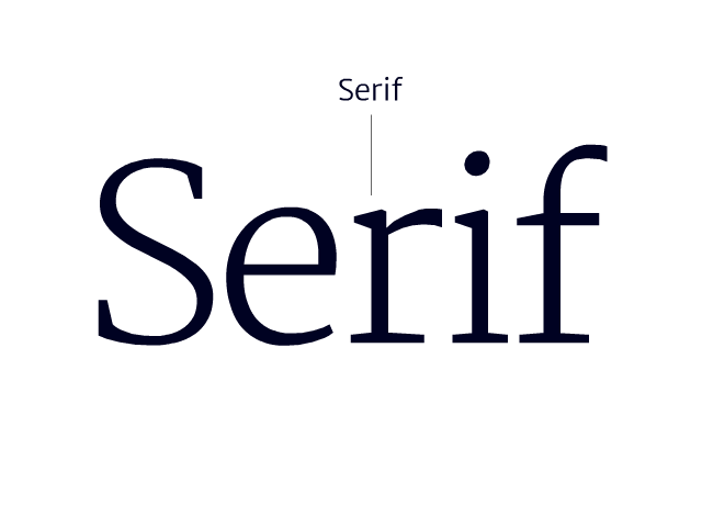
There are several typeface categories, but for now I want to focus on the two most common: serif and sans serif. As you can see in the image below, a serif is a small line or stroke attached to or extending from the open ends of a letter. If you’re new to typography, I recommend sticking to Serif and Sans Serif fonts.
A typeface can have plenty of different attributes that might or might not fit with your brand: technical, bold, serious, genuine, traditional, modern, playful, avant-garde, geometric, nostalgic, approachable. If you’re building a brand, you should choose your typefaces wisely because, whether serif or sans serif, they evoke different feelings for audiences. To develop a feeling for the differences even in one font category, browse through Google web fonts—serif or sans serif.
Be brave and bold: use more than one font
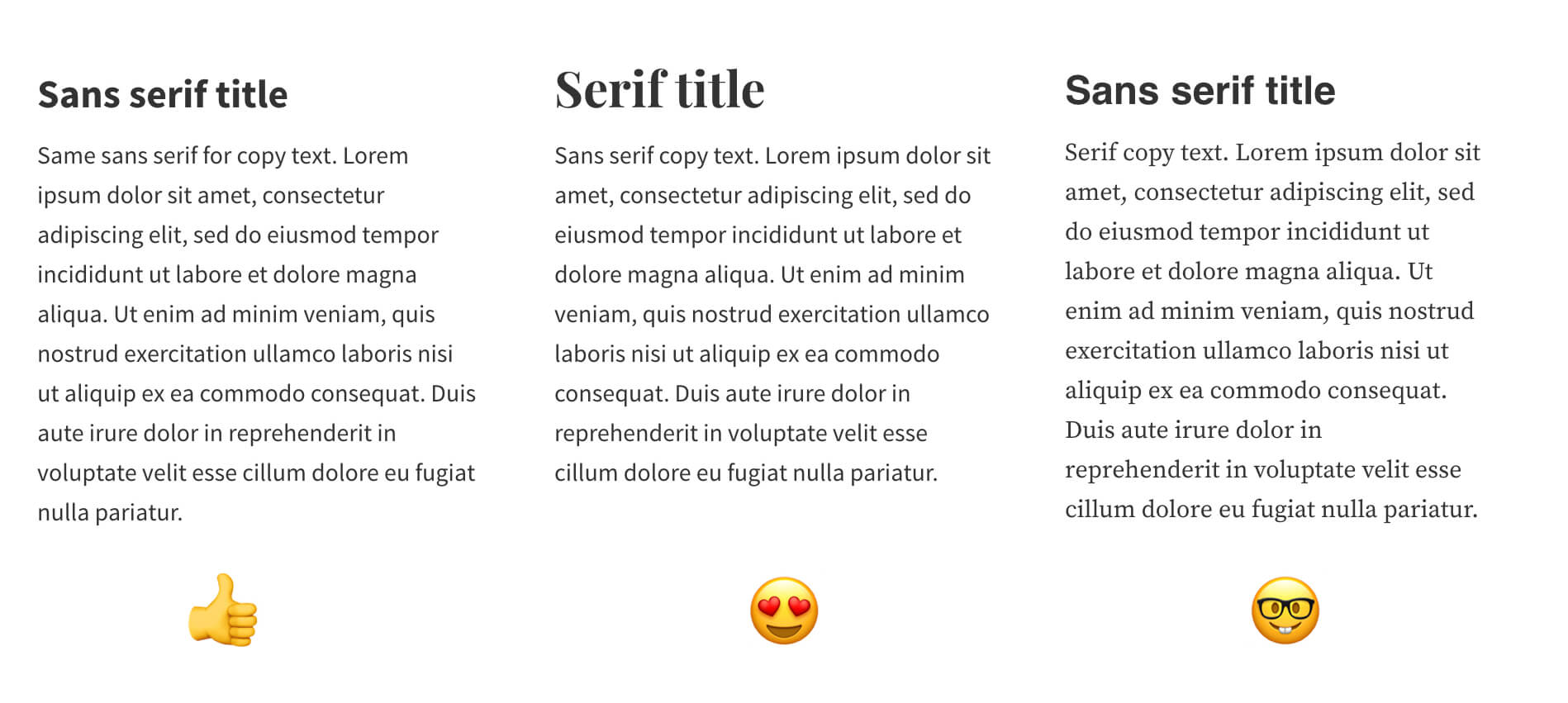
Most designs look best, when two fonts or at least two font-weights are used. If you feel brave, you can choose a font for your headings that stands out a bit. However, the most important criteria to choose your body font is readability. Even the most-celebrated websites, acclaimed for beautiful and innovative design, must communicate clearly to their audiences. This is why Open Sans is so popular. It’s simple, but very safe in terms of readability. Luckily, budget-conscious brands have so many options even on Google web fonts so you don’t have to use the same font as everyone. Sites like fontpair.co can help you to make a good choice. You’ll notice that most of the recommended pairings on fontpair.co are either a serif for the heading and a sans serif for the body, or the other way round. The image below shows three popular ways of combining fonts for titles and body text.
A general rule of thumb: Don’t combine two different fonts of the same category, because it will look more like a mistake than a purposeful choice. Unfortunately, Google web fonts often suggests combinations of two different sans serif fonts. Please don’t fall for this!
Google web fonts is still a good resource for fonts. To get the most from Google's fonts, start with their most popular selection and look for fonts with at least 3 different weights (e.g. regular, medium, bold). These are useful simply for the reason that the designer must have put some serious effort into creating the font.
Finding inspiration
Designers don’t just come up with the most creative ideas out of nothing. We look for inspiration outside our offices and this also applies to finding the right typeface. Personally, I constantly look for news about big companies rebranding, because I'm always curious about their typefaces. A lot of those brands introduce their own custom fonts and it seems to become even more common. However, most of them use similar typefaces, that are universally described as modern, clean, simple, human, friendly. It’s hard to really distinguish them and still every brand wants to be unique. From a designer's point of view, it can be a bit of a drag.
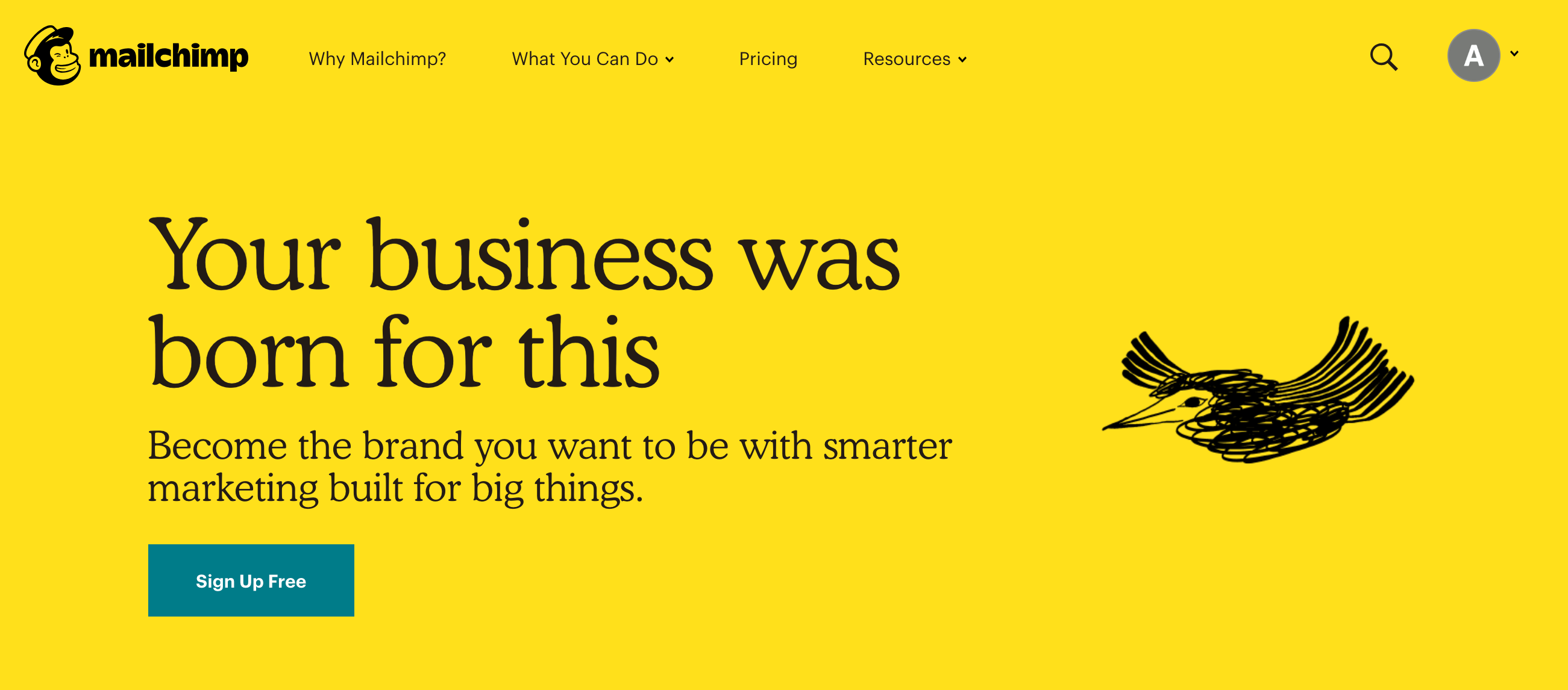
Luckily, some brands don’t follow this boring trend. Mailchimp, for instance, recently relaunched a refreshing different look with Cooper Light as their new core brand typeface. It’s a font with exaggerated, rounded serifs and not new at all. The bold version Cooper black is almost 100 years old and mostly associated with the 1960’s and 70’s pop culture.
“It can be dressed-up and editorial or casual and approachable. You may have seen its larger cousin on dusty old funk records and inside questionable sandwich shops.”
– Mailchimp about their typeface Cooper Light
It’s a nice example of how you can create something recognizable with something old. And with the right combination of typeface and illustrations. Note that the salient Cooper Light is only used for larger headings. The font for all continuous text is a modern highly readable sans serif font called Graphik.
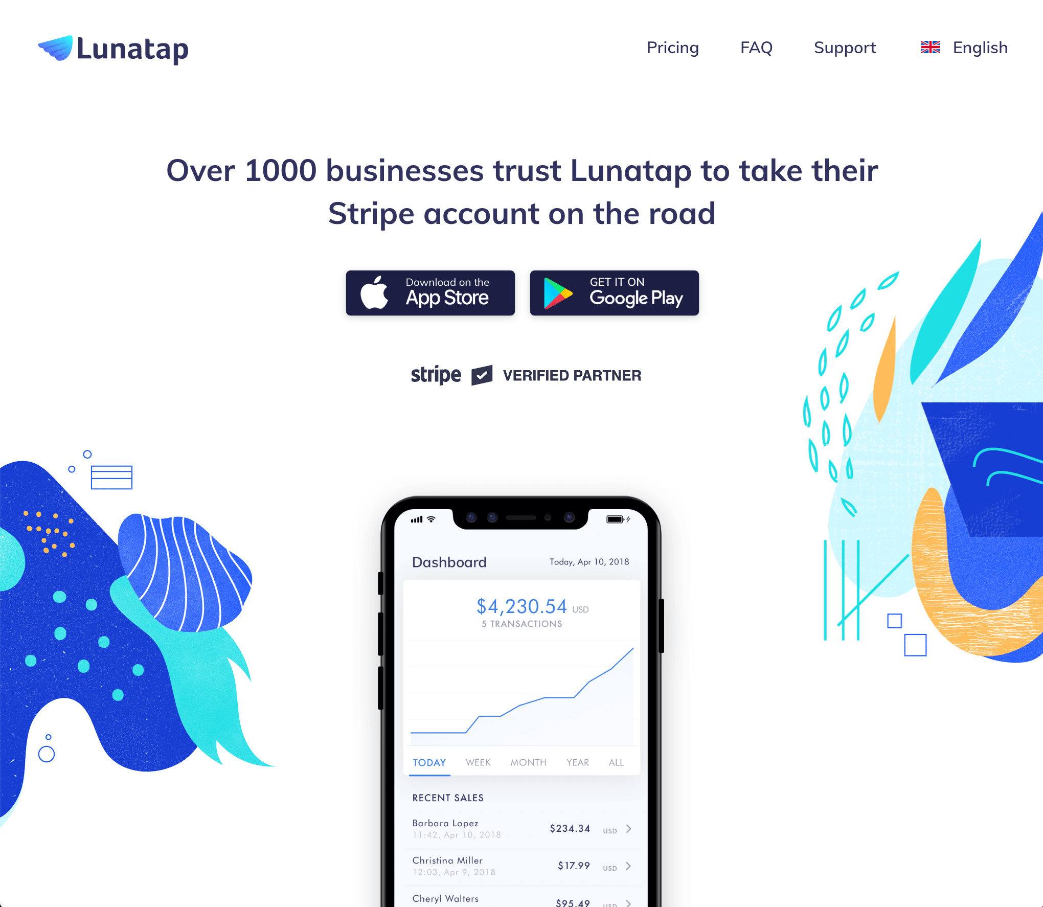
While Mailchimp uses fonts that are available at type foundries for a fee, Lunatap created a beautiful website using a free font called Muli. It is a sans serif typeface designed by Vernon Adams, creator of numerous other open-source fonts available at Google Webfonts. Lunatap’s design is a good example of using a single font with different weights across several platforms. When creating a visual identity, you ideally choose a font that works on your website, in your app interface and on your business cards. I think, Lunatap does an excellent job being consistent and still visually interesting by using the font Muli.
By the way, this typeface has one particular characteristic, which is the lowercase “a” letter that makes it stand out from other sans serif typefaces. It is a “single-story a” which we use in handwriting, calligraphy or in digital italics. The probably most famous font that has the single story a is Futura. The font that is used for the Evolving Web blog on the other hand uses a “two-story a”.
If you want to train your eyes spotting differences in sans serif typefaces, look at the lowercase “a” and “g”. The latter also comes in either single or double variants. Have a look at the the image below to understand the differences between the more minimalistic one-story font Muli and the more complex font Fira Sans with a two-story “a” and “g”.

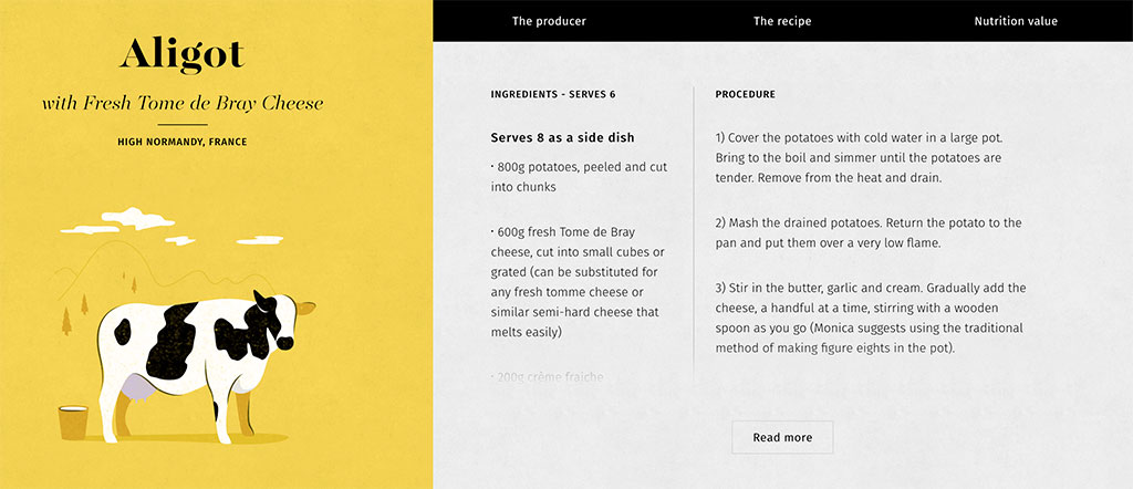
Fira Sans is one of my go-to typefaces for copy text, because it merges high readability with a little bit of esthetic depth. Combining Fira Sans with an elegant display serif typeface for headings works especially well for editorial website types as 12dishes.com proves.
Most people don’t spend a lot of time thinking about typefaces. And why should they you could think – that's a designer's job! But even if you are not a designer, you probably sometimes have to create a presentation or type a document. Or maybe you’re working on a side project that includes a website. This means you're making decisions about typography each time.
When a company's business objectives are understood, goals analyzed and design decisions are made, fonts and typefaces help turn audience engagement into action. Fonts are more than just letter-shapes. They're what shapes your brand.
If you want to learn more about how to choose and mix typefaces, check out these websites:
https://designmodo.com/pair-typefaces/