
In the higher education context, we often have to work within the constraints of an existing framework.
Many institutions have a standardized website template that limits you to certain types of content with a certain look. It may even dictate which menu items appear in the navigation or which content types you can use on the front page. Even if you’re allowed to build a website from scratch, you’ll often have to follow a style guide and wait a while for approval and a budget.
Of course, there are big benefits to having these limitations—including a consistent experience between sites for end users, support from a central web team, and standardization that enhances accessibility and SEO.
Nevertheless, you might feel “stuck” using a pre-selected CMS that’s relatively locked down in terms of features and customization.
Luckily, there are ways to work more effectively and creatively within your CMS’s limitations. Here are six tips to make your website content shine, regardless of the constraints and guidelines your higher education institution has in place.
1. Experiment with Various Components
Many CMSs give you a set of building blocks—also called components, modules, or paragraphs. You can use them to construct visually appealing pages in different styles and layouts.
These blocks aren’t always available across every page of your website. Get to know your CMS and see which types of pages are the most flexible. Look for a page type called “landing page” or simply “page” and see what options you have.
In WordPress you may be able to assemble pages from smaller elements using tools like Gutenberg or Elementor. In Drupal you can drag paragraphs up and down on the page, and apply different style options to them.
I recommend experimenting with a test page made up of various components. Try out ones you’ve never used before and see what all of the different styling options do. Mix together images, videos, and other media to see what looks the best on the page. Keep playing around until you find the right balance of text and visual content.
2. Get More Mileage Out of Your WYSIWYG Editor
If you don’t have the type of components described above, or they’re not available for some of the content you want to create, you might have to get creative with how you’re using your WYSIWYG editor.
A WYSIWYG editor is the interface you use for authoring long-form text on a website. It usually has some tools for creating headings, embedding media, and changing the styling of your content. You might have used it in the past to add a link or upload an image, but there are probably some features you haven’t discovered yet.
For example:
- Use different heading levels to make content easier to skim read
- Break up large sections of text with bulleted / numbered lists
- Add captions when embedding images
- Try different text styles, sizes, or colours to create eye-catching callouts (remember to stick to brand guidelines and accessibility standards)
Learn more about crafting content with CKEditor 5, the default WYSIWYG editor in Drupal 10, or learn how to expand the functionality even further with CKEditor 5 modules.
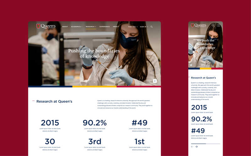
Using a large font size can help you create engaging callout statistics. See more from Evolving Web’s collaboration with Queen’s University.
3. Streamline Your CTAs to Increase Engagement
Too many calls to action (CTAs) can overwhelm your audience and confuse them about what to do next. You can drive user behaviour more effectively with fewer, clearer, more consistent CTAs.
For instance, on some pages it might be appropriate to link to only one or two different pathways. It also helps to put the CTA in a similar place on each page, so that users learn where to look for it.
One example of this concept in action can be found on the Princeton International website. The CTA to find out about funding opportunities is located in the bottom right corner of both the general overview page and the funding for international activities page. Having the link about funding in the same place on different pages helps students know where to find it. This in turn can help reassure students if they are hesitant about applying for an exchange due to cost.
Some CMSs come with tools that make it easy to make each CTA look consistent. For example, there might be an option to embed a CTA in the editor or create a CTA component. If you don’t have access to these tools, you might have to create CTAs with a standard HTML link. In this case, try to use consistent wording and placement from page to page. Keep in mind that the linked text should be descriptive—for example, contact us or see our projects. Avoid generic link text such as “click here”.
4. Fake It ‘Til You Make It
In an ideal world your CMS might allow you to create special content types to showcase programs, testimonials, faculty bios, research, and so on. But in reality you might only have access to create news, events, and regular pages.
To get around this, I recommend creating a standard within your website for how you create different types of content. An unofficial template, if you will. You could start with simple documentation that illustrates how to create a program page and provides standards for how images should appear, program details to include, and parameters around the length. It’s also useful to include guidelines around the tone of voice and your target audience.
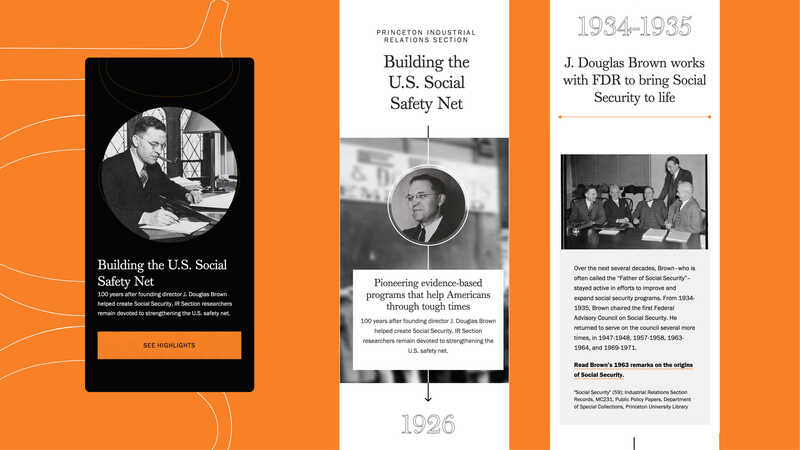
Check out our work with Princeton University’s Industrial Relations Section for its centennial celebration. While you won’t be able to create the same functionality using a locked-down CMS, take note of the unique messaging and imagery that we used to create a special showcase of the Section’s 100 years of history.
5. Create Your Own Content Governance
Speaking of digital standards—content governance is often missing from a website template. This can lead to issues with approvals and outdated content.
Create your own simple guidelines to help your department keep content fresh and on track. Includes the details of:
- Who is responsible for what
- Key pages and when they should be reviewed
- Your primary audience
- Key CTAs
A content audit is a good foundation for a solid content governance plan. We recently conducted a content audit for the University of Guelph-Humber where we assessed the online journeys of three key audience groups: current students, future students, and future faculty. The results provided a clear roadmap to improve the user experience.
6. Use a Style Guide to Build a Sub-Brand
An institution-wide template is important for brand consistency. But your department, faculty, or sub-organization might benefit from a sub-brand that captures its uniqueness. For example, an institution’s library, alumni relations, or athletics department will likely have some specific objectives that aren’t shared with their parent institution. One solution is to create a sub-brand by finding elements of the bigger brand style guide that resonate best with your target audience.
Tone of voice and images are a great place to start. Think about creating some guidelines about how to write and select images in a way that communicates your distinct messaging and resonates with your audience. Provide plenty of examples and “do’s and don’ts”. Also, consider using an AI tool such as ChatGPT to get a feel for which images and tone would be right for your sub-brand.
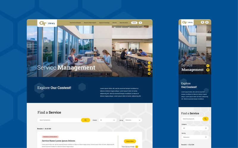
Georgia Tech Library’s website uses photography that highlights the library’s architecture and modern facilities. See more from our work with Georgia Tech Library.