
University websites are notoriously complex. Some of our higher ed clients manage literally hundreds of sites that mirror their institutions’ numerous faculties, campuses, services and audiences.
Designing a good user experience with these unique constraints is no easy task, and it seems like a lot of schools have issues with things like prioritizing their website’s content.
Case in point — I recently stumbled across a tweet that made me do a double-take:
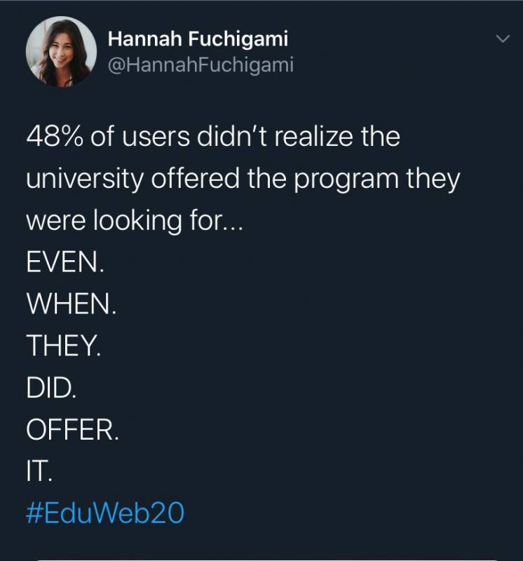
How is that even possible?
Having recently attended #PSEWEB2020, I was more curious than ever about digital experiences in higher ed, so I decided to do a bit of digging. That 48% statistic, it turns out, wasn’t hyperbole: it comes directly from the very respectable Nielsen Norman institute, which has long been one of the leading voices in the field of user experience.
📚 Watch our free webinar, 5 Keys to Success for Using Drupal in Higher Ed, hosted by Evolving Web co-founder and Drupal Association board member Suzanne Dergacheva.
Here are a few other findings that bring to light some important considerations when it comes to university website design.
Site search needs attention
Seventy percent of respondents to a 2019 survey from mStoner and Funnelback said that search was more important to their website visitors than it was three years ago (and only 6% said it was less important).
Yet among those same respondents, a good majority were using Google Custom Search rather than a CMS-based approach. It’s unsurprising that 53% said that their biggest pain point for site search was that internal search returned old or irrelevant results.
An example from the study: for the search query “Tuition”, the correct page was the first result in only 33 out of 54 sites tested.
Even worse, only a single respondent used filters in their search; the other 53 didn’t offer that functionality to users. More than half of students favour websites that let them personalize the content they’re shown according to their needs, and implementing a filtering system for search results is a fairly simple way to offer a more customized experience.
Takeaway: Your students, staff, prospective students and alumni all need site search. Invest in a custom, CMS-based solution; custom Google searches won’t cut it in such a complex content ecosystem. And make search results filterable!
Information overload is real
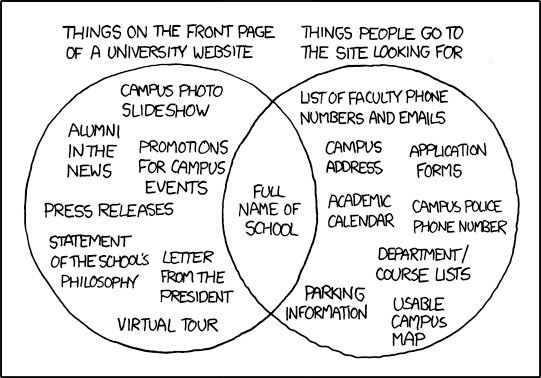
There’s definitely some truth to XKCD’s depiction. It’s not that things like press releases and letters from the president don’t belong on the site, but they certainly shouldn’t be the first things visitors see when they arrive on the homepage.
Key content
A recent MeasuringU study found that the most common information needs among visitors to a university website are:
- Learning more about the school
- Finding information about programs
- Looking at course information
That seems simple enough, but university websites often miss the mark. On top of the sheer volume of information involved, a big challenge is keeping content complete and up to date across numerous silos (departments, faculties, etc.).
One quote from the study sums it up nicely:
“There are SO MANY OPTIONS and so many pictures. It’s so much content coming at me right from the start that I find it overwhelming at first.”
So how can universities strike the right balance between the quantity of information contained on their site, and the findability of that information? First of all, it’s important to have in mind what content is most important to each audience.
For students, the most valuable information topics are, in order of importance:
- Tuition costs
- Scholarships
- Academic programs
- Financial aid
Findability through navigation
A good way to ensure that all audiences are able to find what they’re looking for among large volumes of content is to offer different navigational schemes.
For universities, this typically means providing three distinct ways to navigate:
- Audience-based navigation. This is particularly important for universities, which have an especially broad variety of audiences to serve. Offering audience-based navigational cues helps to funnel visitors into the section most relevant to them.
- Content-based navigation. These are the standard navigation labels that describe different sections of the website - think ‘About’, ‘Admissions’, ‘Campus map’. This type of navigation is important for any website, but to prevent information overload, it’s a good idea to narrow the scope with the other two complementary navigation options.
- Utility-based navigation. This navigation scheme typically uses labels that are verbs: “sign in to student services”, “view your admission status”, “pay your tuition”.
To help users quickly find what they’re looking for, use these different navigation options as ‘welcome mats’ for your site. This is what should be emphasized on your homepage.
Alongside your different navigation patterns, breadcrumbs are essential: in complex information environments, users benefit from a constant reminder about their current location on the site. In addition to helping visitors navigate between related pages, breadcrumbs provide valuable context about the page itself.
Finally, don’t bury important information in multiple levels of sub-menus. In user research sessions we conducted for McGill University’s Desautels faculty, we found that participants struggled to retrieve certain information because it was located too deep in the site structure.
Visual communication is increasingly important
Video
In its 2019 E-Expectations Trend Report, which focused on the college search process, OmniUpdate found that prospective students across all age groups had a favourable opinion of video content.
The topics students rated as most appealing were those that helped them get a feel for campus life:
- Classroom and campus experiences (69% favourable)
- Campus activities (64% favourable)
- Campus tours (60% favourable)
- Residence hall tours (50% favourable)
- Classroom tours (42% favourable)
The same report found that viewer attention span is on the rise. Most students were willing to watch videos up to three minutes long.
Images
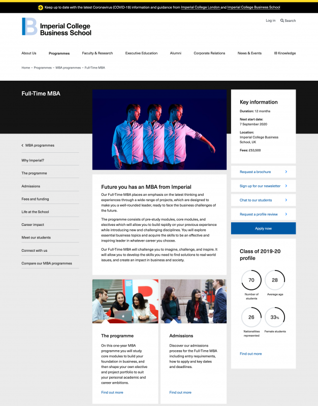
One thing that comes up frequently during user research sessions with our university clients is the fact that many pages are perceived to be text-heavy, and therefore unappealing. Below is an excerpt from a recent study that features a good example of a page that was deemed appealing: colourful, lively, and with minimal text.
When it comes to images, the more something looks like a stock photo, the less appealing it is to students. Images depicting people, for example, should feature real students and staff rather than models whenever possible (as seen in the example below). Showcase pictures that prospective students can project themselves into, and be mindful of accurately depicting your school’s diversity to communicate an inclusive message.
Research on audience preferences has found that your campus should be the star of the show image-wise in website sections targeting a student audience.
Need more personalized assistance?
If you need more personalized assistance for your institution, don’t hesitate to reach out to Evolving Web’s team of web strategists, designers, and developers. Our open source agency builds human-centric digital experiences for higher education, and we’d love to hear about your project.
Check out these other resources: