
During COVID, we started thinking a lot more about creating a sense of place in designing interfaces online. Digital experiences became more significant in forming our impression of brands and institutions. Rather than visiting a university, we plunge into the website to see what it’s like. Rather than going to a conference to find new partners to work with, we do our research completely online. Rather than hearing about a new funding program through our work colleagues, we figure out how to participate through the website.
And while the website often gives people their first impression of an organization, it plays a larger and larger role in how people interact.
Creating a sense of place is about showing more than telling, communicating purpose and also culture. There are so many ways to do this. Here are a few ideas to get you started:
An Immersive Experience
Just like a building can attract users’ attention with an impressive foyer or unique architectural features, your digital experience can catch users’ impressions by taking over the page. Think of photos, maps, and components taking up the entire screen. A confident, welcoming message, a full-page image or video, or a snapshot of what’s important to your organization can likewise grab the user’s attention and set the tone for their experience to come.
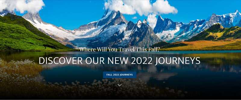
Journeys by Van Dyke is an example of how full-page images can create an immersive feel.
Coherent Interface Elements Fading Into the Background
Some websites and apps try to innovate in terms of navigation. While this can create a strong impression, it can also distract the user, forcing them to learn new design patterns. If you have a strong brand and elements that capture the user’s attention, you can rely on standard patterns for navigation and search, so that users instinctively know how to interact with the website
Wayfinding That Promotes Exploration
Sometimes, when creating the strategy for a website, we are aggressive with our efforts to convert users and get them to the next step in our sales funnel. Our calls to action use strong verbs. But using softer calls to action that invite users to learn and browse, prompts them to explore and makes them feel like they better understand what you do. When creating a sense of place, longer user journeys can still help you achieve your goals.
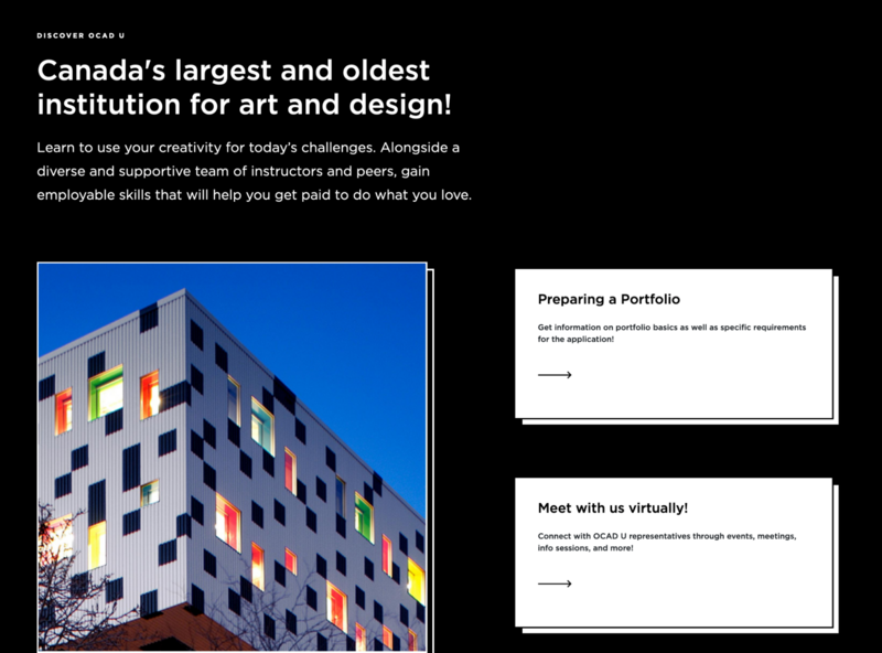
OCAD U: The Admissions website invites potential students to take the next step in their journey, with predictable calls to action that lead naturally from the content on the page.
Real-life Imagery for Different User Perspectives
Imagery goes a long way to forming a user’s impression. Each image should serve more than one purpose. It can illustrate a concept or idea, while also setting the mood, giving users an idea of what it’s physically like to transact with you. Bringing in multiple perspectives through your imagery creates a stronger impression on users.
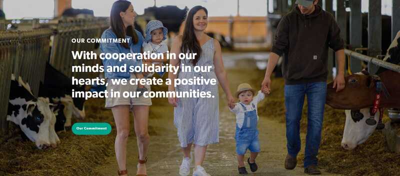
The imagery used on Sollio Cooperative Group’s website is inspiring and conveys a fresh, real-world atmosphere.
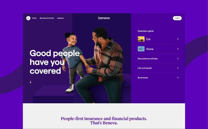
Beneva’s website has real-life images that make it easy for users to relate to the brand.
Careful Use of Storytelling Videos
A video can pull a lot of weight in describing your values and telling your story. It’s not necessary to create a lot of videos to achieve this. One or two that can visually tell a story, that visually resemble your place and welcome users to see themselves participating in what they can do there.
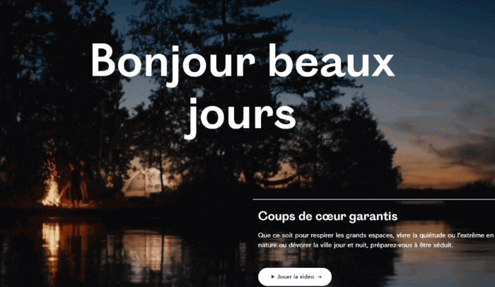
Tourisme Québec: A looping video on the homepage makes users feel like they’re already in Quebec.
A Search Experience That Promotes Discovery
Search is more than just looking for a specific piece of information. When you visit a museum or store for the first time, you might take a few minutes to look around or wander. While we can’t replicate this online (nor would we try), we can give users the same type of experience by giving them suggestions for what to search, or glimpses of the type of content they can find under the surface.
On-site search is an opportunity to help users choose their own adventure and decide how they want to dive into the content.
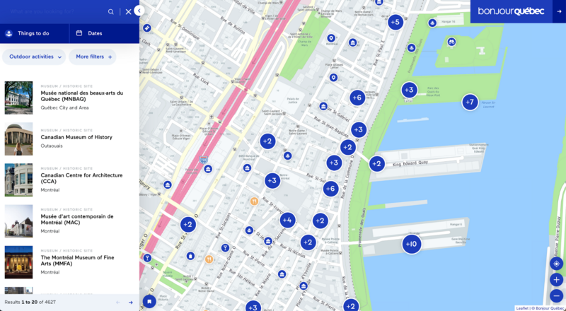
For Tourism Québec, Evolving Web built an interactive map that invites users to explore
A Sense of Place That Extends From Page to Page
Unlike most real-life experiences, a digital experience is not likely to start at the front door. Many site visits start on a landing page or article, not the homepage. One challenge is to create a sense of place that permeates these deeper pages so that someone landing on your website has a sense of what you’re all about. Integrating related content and weaving some visuals and hints of the brand into every page can help with this persistent place-building.
Understanding where in the website you landed is essential too. Breadcrumbs and clear navigation menus give visitors clues to find their way around. In that sense, web interface design has a lot in common with signage and wayfinding design in the real world. After a flight, you disembark at a terminal and a gate that you have never been to before. Good signage design makes sure you don’t feel lost and points you to your connection terminal or the baggage reclaim area.
If you’re considering a redesign and are looking for ways to create an experience that really captures your users’ attention, consider some of the techniques described above. If you’re looking for more inspiration, you can explore some of the design projects we’ve done at Evolving Web.